Logo design trends 2026 favor flexible systems over single, fixed marks. Logos now need to move, shrink to an app icon and still feel made by a person.
Those trends are the recurring styles, colors and type choices showing up across new identities this year. Four forces drive them: small screens, motion, AI-generated design and a demand for authenticity.
The top styles include adaptive logo systems, motion-first logos, humanized minimalism, hand-drawn imperfection and expressive wordmarks. AI speeds up exploration but also breeds AI-generated sameness. Greens, deep teals and soft neutrals lead the color story, while type gets sharper and bolder.
Responsive and animated logos are rising because one static mark can't cover every screen. Meanwhile, safe flat "blanding" and generic AI-look marks are fading. Below, you'll learn how to apply each trend and keep a timeless brand mark from dating fast.
What Are Logo Design Trends?
Logo design trends are recurring visual patterns seen across many new logos and identity systems each year. They cover shapes, colors, typefaces and motion. A trend is a signal about design direction, not a rule your brand identity must follow.
Designers and brands read these market signals to spot what feels fresh and what feels tired.
What Drives Logo Design Trends in 2026?
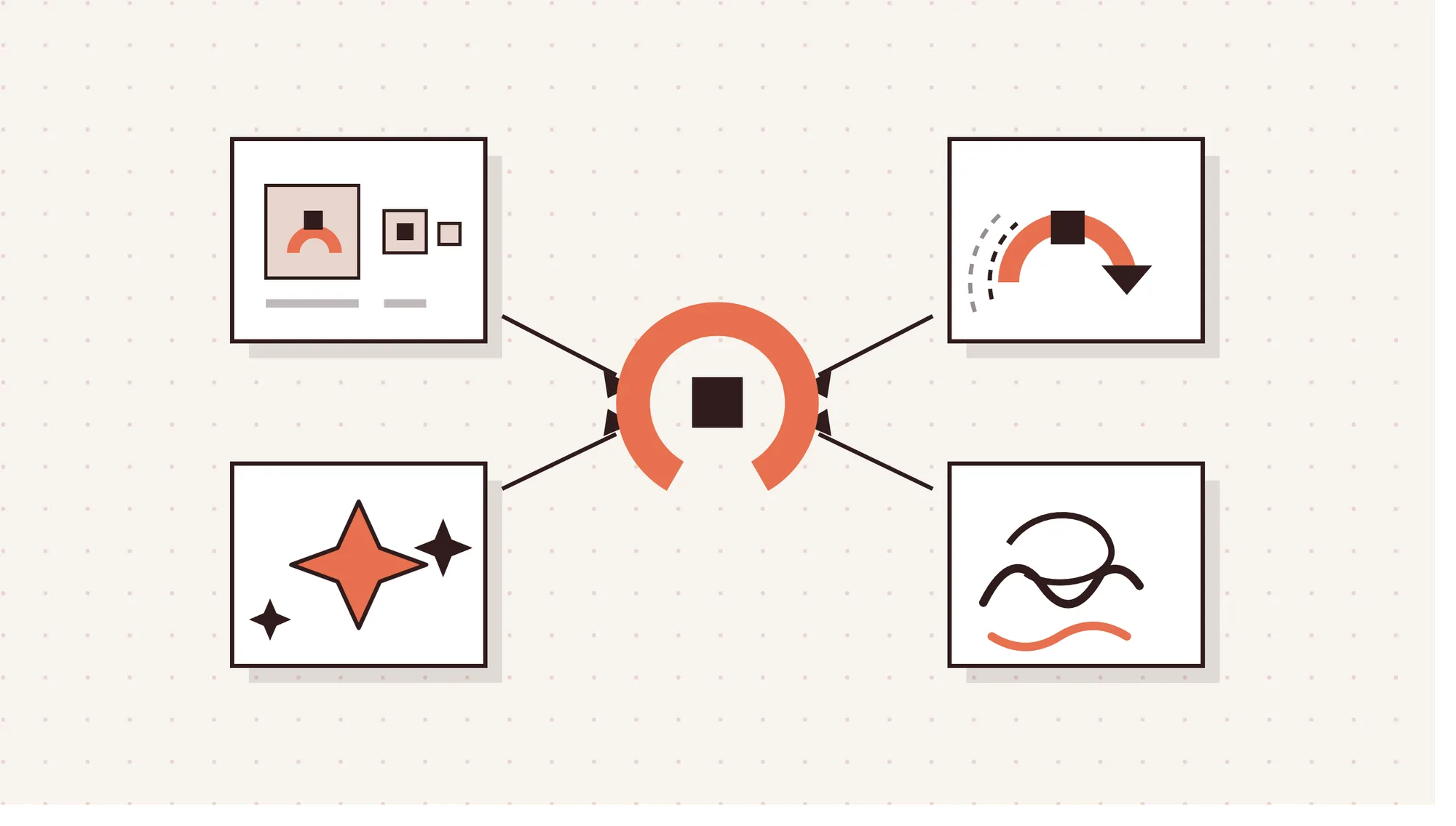
Logo design trends in 2026 are driven by smaller screens, motion, AI and a demand for authenticity.
4 forces driving logo design trends in 2026 are outlined below.
- Small screens and app icons. Logos must stay legible at 16 to 32 px avatar sizes. So designers start small and build an avatar-safe version first.
- Motion and digital-first touchpoints. Brands meet people through apps, video, social feeds and dark mode screens. A logo that can animate fits these brand touchpoints best.
- AI-generated design and human authorship. AI tools make polished logos fast and cheap, so many marks start to look alike. Brands answer with visible human details that a generator wouldn't produce.
- Demand for authenticity, warmth and trust. Audiences favor brands that feel honest and approachable. Softer shapes, earthy colors and imperfect linework help a logo feel friendly.
What Are the Top Logo Design Trends for 2026?
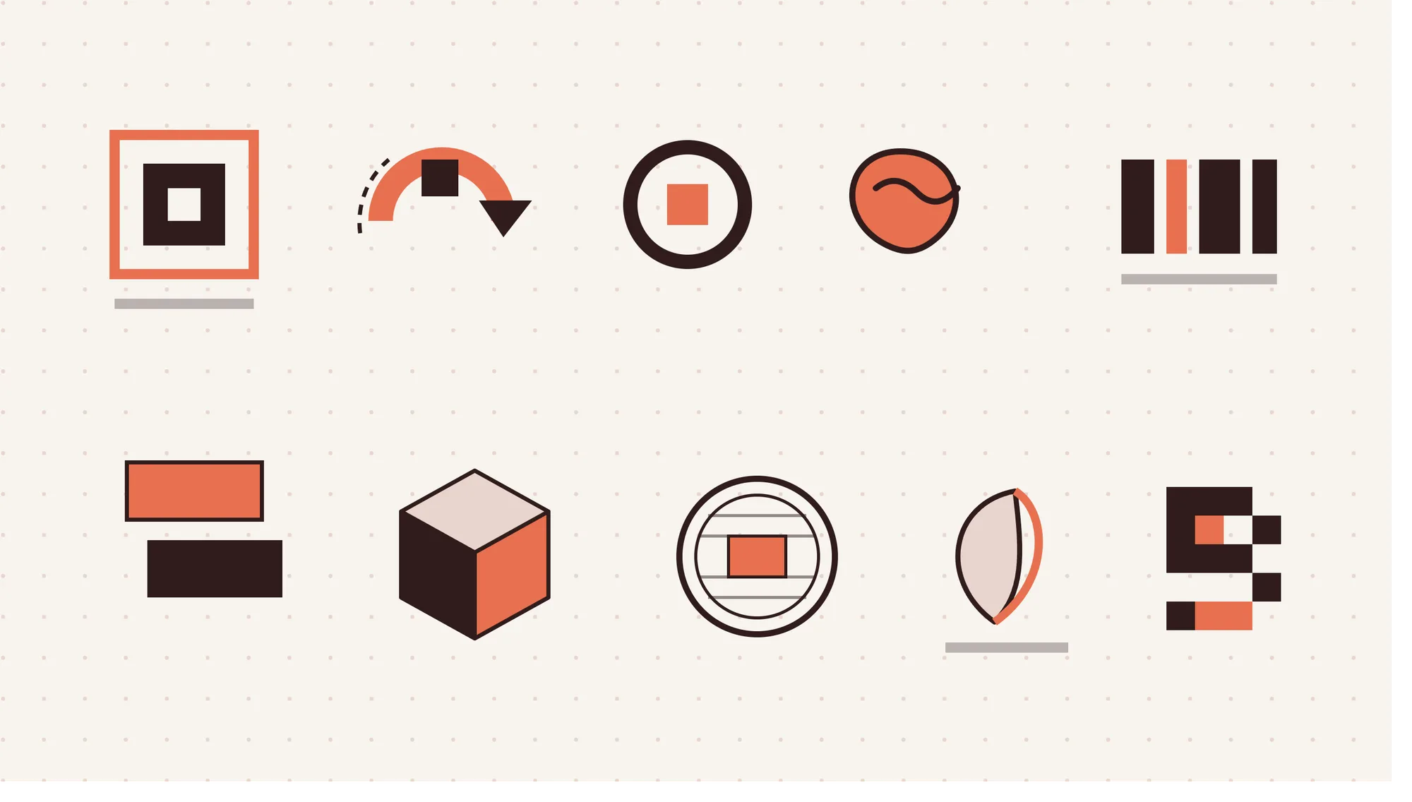
The top logo design trends for 2026 mix flexible systems with visible craft. LogoLounge reviewed more than 30,000 logos and identity systems for its 2026 trend report. Its big theme is movement, with designers as "architects of possibility" who build toolkits, not static marks.
The 10 top logo design trends for 2026 are given below.
1. Adaptive logo systems and logo kits
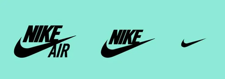
A logo kit is a family of versions that share one bone structure. Each version fits a different size or channel. LA28's emblem shows the idea, with a changing "A" between a fixed L and 28.
2. Motion-first logos
These marks are designed to animate from day one, using one clean expand, flip, loop or reveal. Airbnb treats motion as a core part of its brand expression.
3. Micro-first and humanized minimalism

Micro-first design starts at the smallest size and adds detail only when space allows. The result is still minimal, but warmer than the sterile flat marks of the late 2010s.
4. Hand-drawn imperfection and naive marks
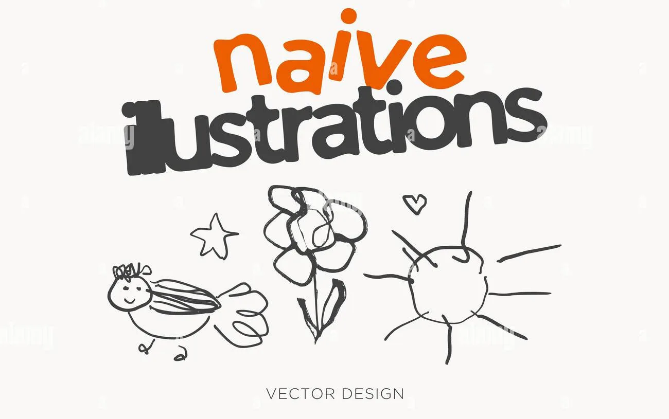
Naive marks keep wobbly lines, uneven strokes and simple mascots that show a person made them. Mailchimp's hand-drawn illustration style is a familiar example.
5. Expressive type-led wordmarks
Wordmarks are taking center stage. Custom lettering, variable fonts and type collage wordmarks give the name itself the personality. Dropbox shows how a wordmark and custom type can carry much of an identity.
6. Signature quirk details
One memorable quirk makes a simple logo easy to recognize. Examples include sliced letters, odd counters or a clever negative space cut. Pepsi's 2023 refresh set its wordmark back inside the globe, one bold move that carries the mark.
7. Tactile 3D and gradient depth
Dimensional logos with soft lighting and rich texture are back, without heavy skeuomorphism. Netflix's ribbon-style N monogram is a well-known take on clean depth.
8. Heritage linework and stamp-style seals
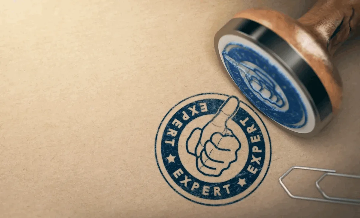
Crafted linework borrows hatching, guilloché borders and etched icons from banknotes and old certificates. Stamp and seal logos use ringed borders and arced text, like a postmark.
9. Organic earthmarks

Earthmarks use gentle curves, leaves and muted earth tones to signal warmth and care for nature. Patagonia's mountain wordmark is a long-running example. The 2026 version skips cliché leaf-and-globe icons for quieter natural shapes.
10. Retro revivals in pixel, neo-deco and gothic styles
Pixel marks use tight 8 to 16 pixel grids that read well at favicon size. Neo-deco brings back chevrons, arches and sunburst lines. Metal gothic lettering adds blade-like edges for fashion, gaming and streetwear brands.
How Is AI Changing Logo Design in 2026?
AI is changing logo design by speeding up exploration and production while raising the bar for originality. Clutch's March 2026 report found 88% of businesses use AI design tools. Yet 90% still use graphic designers.
6 ways AI is changing logo design are shown below.
- Faster concept exploration and mood boards. Generative AI tools turn a brief into dozens of rough directions in minutes.
- AI logo generators for DIY starting points. Founders on tight budgets use AI logo generators to test styles and colors. The output is a draft, not a brand identity.
- AI-assisted vector editing, resizing and asset production. AI now handles repetitive work like cleaning paths, resizing assets and exporting formats. Designers get more time for vector refinement.
- AI and 3D rendering tools fueling tactile marks. LogoLounge ties the rise of tactile 3D logos to the surge of AI and advanced rendering tools. Dimensional concepts are now faster and cheaper to explore.
- A counter-trend toward visibly human marks. Many brands push back against AI output with hand-drawn lines and odd quirks. Visible human authorship helps them stand out.
- Logos built for AI-driven discovery. AI assistants and search answers often show brands as tiny icons beside text. A simple, legible mark is easier to recognize in those cramped spots.
Strategy, originality checks and final refinement still sit with the human designer. AI can generate options, but it can't judge brand fit or clear a trademark search.
What Are the Logo Color Trends for 2026?

The logo color trends for 2026 are greens, deep teals, soft neutrals, warm earth tones and gentle gradients. Brands also use fewer colors, more deliberately.
5 logo color trends for 2026 are outlined below.
- Greens in many shades. LogoLounge notes that green dominates 2026 logos, from warm organic tones to electric, yellow-leaning greens.
- Deep blues and teals. Saturated YInMn blue keeps showing up in new marks. WGSN and Coloro named Transformative Teal, a blue and aquatic green blend, their 2026 color of the year.
- Soft off-whites and neutrals. Pantone chose Cloud Dancer, PANTONE 11-4201, as its Color of the Year 2026. The airy white suits calm, minimal identities with generous negative space.
- Warm earth tones. Oat, cream, terracotta, clay pink and sage give logos a cozy, handmade feel, especially with paper textures.
- Soft atmospheric gradients. Lilac, misty blue and blush blend in gentle two-tone fades. They suit wellness and tech brands that want to feel calm.
Across all five, the shift is toward a limited palette. Spotify shows how one signature color can carry recognition on its own.
What Are the Logo Typography Trends for 2026?
The logo typography trends for 2026 are slant breaks, custom wordmarks, sharp cuts, ink traps and type collage. Together, they let the name do more of the work.
5 logo typography trends for 2026 are given below.
- Slant breaks. One italic letter sits inside an otherwise upright Roman wordmark. LogoLounge lists Slant Break as a 2026 trend.
- Bold, high-contrast custom wordmarks. Brands commission a custom typeface or lettering instead of licensing a stock font. Heavy weights and strong contrast hold up at small sizes.
- Sharp dagger endings and deep cuts. Pointed terminals and sliced strokes signal precision, speed and competition. They suit sports, gaming and tech brands.
- Exaggerated ink traps and open counters. Ink traps are small notches where strokes meet. Oversized versions, paired with wide open counters, turn a technical detail into personality.
- Type collage hero wordmarks with a quiet twin. Loud, mixed-type wordmarks work like posters on big formats. A simpler "quiet twin" handles app icons, favicons and other small spaces.
Why Are Responsive and Animated Logos Trending in 2026?
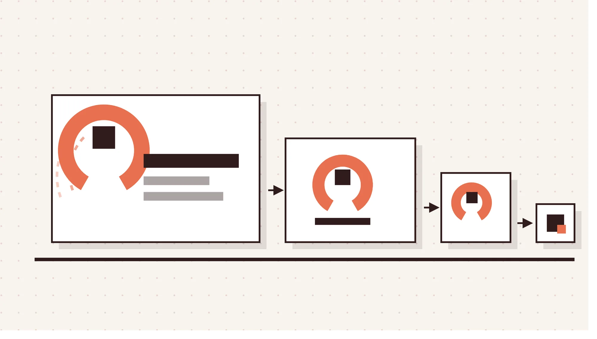
Responsive and animated logos are trending because a single static mark can no longer cover every screen. One brand might appear on app icons, watch screens, social avatars and dark mode sites.
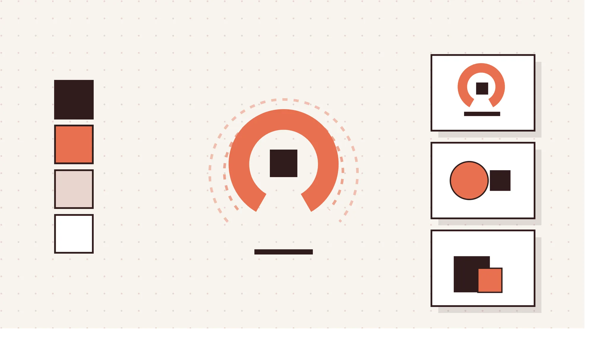
A responsive logo system handles that range with 4 common levels, listed below.
- Full mark. The complete logo, used on websites, signage and print.
- Simplified mark. A lighter version that drops fine detail for mid-sized placements.
- Icon. A compact symbol built for app icons, favicons and social avatars.
- Monogram. One or two letters for the tightest spots, like watch faces.
Test the icon level hardest, since it sits beside other icons and inside your mobile app design. Motion-first logos follow the same logic for video, apps and social. The key rule is that every motion logo must still work when static.
Lightweight delivery keeps motion practical. Variable fonts let letterforms shift weight in code, while Lottie files or CSS animation keep files small. Morph-marks use the same tools to bend and react on screen.
Which Logo Design Trends Are Fading in 2026?
The logo design trends fading in 2026 are overused motifs and safe styles that no longer stand out.
5 logo design trends fading in 2026 are outlined below.
- Script L's with flourished monograms. LogoLounge flags looping script L's, often mirrored into monograms, as a saturation signal this year.
- Feathers, pennants and watermelon marks. The same report spotted a flock of feathers, more pennants and a crop of watermelon marks.
- Safe, flat geometric sans "blanding." Interchangeable geometric sans wordmarks make brands blend in. Corporate minimalism with no quirk now reads as forgettable branding.
- Hyper-polished, sterile gradients. Glossy gradients with no idea behind them feel like stock templates.
- Generic AI-look marks. Logos that look prompt-generated, with no clear concept, signal low effort. Audiences notice that sameness quickly.
How to Apply Logo Design Trends to Your Brand?
To apply logo design trends to your brand, start with what people recognize and add only what fits. The goal is a brand refresh, not a costume change.
6 steps to apply logo design trends to your brand are given below.
- Audit the current logo and brand equity. List what customers already recognize, such as a color, shape or letterform. That's your brand equity, so protect it.
- Pick one trend that fits your personality and audience. A naive mark suits a café. A bank may suit refined linework better.
- Keep the core mark recognizable. Choose subtle iteration over a full overhaul. Small changes to weight, spacing or color can refresh a logo without losing recognition.
- Design the logo kit. Build a full mark, an icon and a monogram from the same structure.
- Test at small sizes, in one color and in dark mode. Run a black and white test, then check the one-color version at app icon and avatar sizes.
- Roll out with brand guidelines. Document clear space, minimum sizes, color codes and motion rules so every team uses the logo correctly.
Each step can run in-house, or with a partner that handles brand refresh and redesign end to end.
How to Keep a Trend-Led Logo From Looking Dated?
To keep a trend-led logo from looking dated, put trends on the surface and keep the structure timeless. A strong core mark can wear a trend without being defined by it.
Tips to keep a trend-led logo from looking dated are outlined below.
- Build on a strong, simple core shape. Timeless construction means a shape that reads in one color and at any size. If it works in black and white, trends become optional layers.
- Apply trends to secondary assets. Put trend-driven motion, color and texture into animations, patterns and social graphics. Those pieces are cheap to update, while the core mark stays put.
- Use one distinctive micro-detail. Pick a single quirk instead of stacking three trends at once. Restraint keeps the mark memorable and helps it age more slowly.
- Review every few years and refresh gradually. Check the identity against new screens and competitors every few years. Gradual refreshes protect longevity better than dramatic redesigns.
How Long Do Logo Design Trends Last?
Most stylistic logo design trends last a few years before they start to feel tired. Structural shifts, such as logo systems, motion and small-screen legibility, last much longer because they solve real problems.
LogoLounge flags saturated trends every year as they wear thin. So a style can go from fresh to overused within one trend cycle.
Is Minimalism Still in Style for Logos in 2026?
Yes, minimalism is still in style for logos in 2026 because simple marks scale best across screens. But the sterile, flat version has faded.
The 2026 take is humanized, micro-first minimalism. Clean lines stay, plus one personal detail like a soft curve or a hand-drawn stroke. That restraint keeps the logo clear without making it anonymous.
Which Logo Trends Will Carry Into 2027?
The likeliest survivors are trends that several 2026 reports agree on. Treat each as a likely direction, not a certainty.
4 logo trends likely to carry into 2027 are given below.
- Adaptive logo systems. Brands will likely keep needing logo kits that flex from billboards to watch screens.
- Motion-first marks. Video and app touchpoints keep growing, so motion should stay a built-in expectation.
- A visible human signal. As AI output spreads, hand-drawn details and quirks should keep their value.
- Small-screen legibility. Avatars, icons and AI answer cards make tiny-size performance a future-proof logo requirement.
What Is the Future of Logo Design With AI?
The future of logo design with AI is a hybrid workflow. AI handles exploration, while humans own strategy and final craft.
Adobe's October 2025 Creators' Toolkit Report surveyed 16,000 creators and found 86% actively use generative AI tools. Yet 69% worry about their content being used for AI training without permission. Agentic AI may automate more production, but people still set brand direction.
Teams that offer AI-assisted design and development already work this way, with senior designers reviewing every output.
Will AI Replace Logo Designers?
No, AI will not replace logo designers because brands still need creativity, strategy and human judgment. Clutch found that only 18% of businesses say AI has reduced their need for designers.
Another 32% say AI has replaced only simple design tasks. Design budgets point the same way: 47% of businesses raised graphic design spend in the past year.
Can You Trademark or Copyright an AI-Generated Logo?
You can often trademark an AI-generated logo in the US, but copyright is much harder to secure. The USPTO looks at distinctiveness and use as a source identifier, not how a logo was made.
The US Copyright Office takes a stricter view. Its January 2025 report says purely AI-generated material isn't protected without enough human control over expressive elements.
Before you file, run a trademark search and check the AI tool's commercial-use terms. Keep records of human edits. Treat this as general information, not legal advice.
Should You Use an AI Logo Generator for Your Brand?
No, you should not use an AI logo generator for your final logo because results are often generic. A generator suits early ideas or very low budgets.
A professional designer adds originality checks, clean vector files and clear licensing terms. You also get a full logo system that works everywhere your brand appears.
How Much Does a Trend-Led Logo Design Cost?
A trend-led logo design usually costs between $300 and $2,500 for most startups and small businesses. The price depends on who designs it and how many versions you need.
Typical logo design costs by provider type are shown in the table below.
| Provider type | Typical cost range |
|---|---|
| DIY and AI tools | $0 to $150 per year |
| Beginner freelancers | $150 to $500 |
| Design contests | $300 to $1,500 |
| Experienced freelancers | $500 to $2,500 |
| White label partners | $1,500 to $8,000 |
| Boutique studios | $2,500 to $10,000 |
| Branding agencies | $10,000 to $50,000+ |
Motion versions and full logo kits add cost, since each version needs its own design and testing. For a full breakdown, see this guide to logo design cost.
Agencies that resell brand work often hire white label partners for the design itself. If that model is new to you, start with how white label product design works.
When Should a Brand Redesign Its Logo?
A brand should redesign its logo when the current mark stops working where customers see it. Common signs include poor small-screen legibility, no responsive versions, a mark that resembles competitors or a business pivot.
Even then, subtle iteration often beats a full overhaul. Walmart, Amazon and JP Morgan Payments all made small, careful updates that protected brand equity.
Is a Logo Redesign Worth It in 2026?
Yes, a logo redesign is worth it in 2026 because digital touchpoints expose logos that can't scale. That holds if your current mark struggles on apps, social or search. A clearer mark can lift brand recognition and customer trust.
Refreshing rather than replacing keeps rebrand cost down and speeds up the return on design.
What Are the Pros and Cons of Following Logo Design Trends?
Following logo design trends helps a brand look current, but it can also date the logo fast.
The pros and cons of following logo design trends are given in the table below.
| Pros | Cons |
|---|---|
| Looks current and signals a brand that is active and relevant. | Stylistic trends saturate fast, so the logo can date within a few years. |
| Distinctive micro-details help you stand out from safe, forgettable competitors. | Following the same trend as competitors can make your brand blend in. |
| Responsive, micro-first styles stay legible on app icons and avatars. | New logo kits, motion versions and rollouts add real redesign costs. |
| Hand-drawn texture adds human warmth and authenticity next to AI-generated work. | A full overhaul can erase brand equity that took years to build. |
| Motion-first marks fit video, web and social touchpoints with ease. | A trend that suits fashion or gaming may clash with trust-led sectors. |
How Do Logo Design Trends Compare With Related Trends?
Logo design trends sit inside a wider set of graphic design, branding and web design trends. Logos change slowest because they anchor the visual identity, while the other disciplines move faster around them.
What Is the Difference Between Logo Design Trends and Graphic Design Trends?
The key difference is lifespan. Logo trends shape the core mark, which a brand keeps for years.
Graphic design trends shape campaign visuals, packaging and social content that change often. So you can follow the latest graphic design trends freely while treating the long-lived identity with more care.
What Is the Difference Between AI-Generated and Human-Designed Logos?
AI-generated logos win on speed and cost, while human-designed logos win on strategy, originality and ownership. A prompt-based output can appear in seconds for very little money.
A designer starts from brand strategy, checks originality and builds a hand-crafted mark with a stronger copyright position. You also get a full, usable logo system rather than a single image file.
What Is the Difference Between a Responsive Logo and a Static Logo?
A static logo is a single fixed mark used the same way everywhere. A responsive logo is a logo family with multiple detail levels that scale by context.
The full version fits a website header, while the app icon version keeps only the essential shape.
Final Thoughts
The smartest way to use logo design trends 2026 is to be selective. Pick one or two trends that fit your brand, then build them into a responsive logo system.
Keep the core mark simple and let motion, color and texture carry the trendier details. Most of all, keep human craft visible, because that's what separates a brand from a template.
If you run an agency, Panze can work as your white label design agency. Our senior designers handle logos, logo kits and brand guidelines behind the scenes, under your name. When you're ready, talk to our team about your next branding project.
Frequently Asked Questions
Are Animated Logos Worth It for Small Businesses?
Yes, animated logos are worth it for small businesses because video and social drive much of their reach. A short logo animation works in social videos, website intros and app screens.
Keep it to one clean, lightweight motion and always keep a strong static fallback.
Is Bold Typography Replacing Logo Symbols?
No, bold typography is not replacing logo symbols, but it is taking on more of the work. Many brands now lead with a custom wordmark and treat the symbol as a secondary asset.
Symbols still matter for app icons and favicons, where a full name won't fit. That's why combination marks with a wordmark and a compact symbol remain common.
Which Logo Design Trends Work Best for Small Businesses?
For small businesses, the best-fit trends are micro-first simplicity, warm earth tones and one distinctive quirk. All three stay legible on social avatars and are affordable to produce.
Skip heavy 3D effects or complex motion unless you can keep them updated. A clean mark with a simple icon version covers most small business needs.
Are Gradient Logos Still in Style in 2026?
Yes, gradient logos are still in style in 2026 because they add depth on digital screens. But the look has softened, with gentle two-tone fades replacing glossy, sterile effects.
Every gradient logo still needs a flat, one-color version. That version handles print, embroidery and tiny sizes where gradients turn muddy.
Is a Hand-Drawn Logo Professional Enough for a Business?
Yes, a hand-drawn logo is professional enough for a business when it's refined into clean vector artwork. The human touch signals warmth and authenticity, which helps a brand stand out from AI-generated sameness.