iOS vs Android app design differs because each platform follows its own design system and user conventions. Apple's Human Interface Guidelines now center on Liquid Glass. Google's Material Design uses Material 3 Expressive.
Navigation differs too. iOS relies on a tab bar and edge swipe, but Android uses a back gesture and navigation bar. Each platform also has its own system font, SF Pro on iOS and Roboto on Android.
Touch targets run 44 x 44 pt on iOS and 48 x 48 dp on Android. UI components and app icons follow separate rules too.
AI is reshaping both platforms, with Siri in iOS 27 and Gemini in Android 17. The final sections show how to design one app that feels native on both.
What Is the Difference Between iOS and Android App Design?
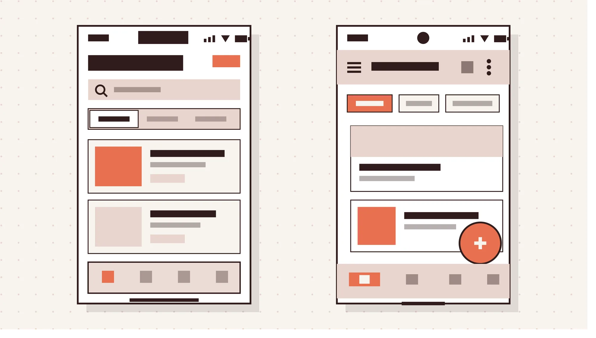
The difference between iOS and Android app design is which platform rules the app follows. Those rules cover visuals, navigation, components and interaction. Apple writes them for iPhone and iPad, and Google writes them for Android phones, tablets and foldables.
Each platform has its own design language. An app that follows it feels familiar. Users already know where the back button sits and how menus open.
The guidelines are recommendations, not strict rules. Still, people carry strong expectations from the apps they use every day. Android adds another layer, since many device manufacturers ship their own screens and system skins.
How Do Apple's Human Interface Guidelines and Material Design Differ?
Apple's Human Interface Guidelines and Material Design differ most in how they create depth and visual hierarchy. Apple maintains the Human Interface Guidelines, and Google maintains Material Design.
On iOS, a translucent Liquid Glass layer holds controls above the content. On Android, Material 3 Expressive leans on bold color, varied shapes and motion instead.
The key differences between the Human Interface Guidelines and Material Design are shown in the table below.
| Attribute | iOS Human Interface Guidelines | Android Material Design |
|---|---|---|
| Maintainer | Apple | |
| Visual language | Liquid Glass, refined in iOS 27 | Material 3 Expressive |
| Depth | Translucent glass layer for controls that floats above content | Semi-transparent surfaces, background blur, elevation and shadows |
| Color | Content shows through controls, and vibrant system colors keep text legible | Bright, bold color, with Dynamic Color tinting surfaces |
| Motion | Content refracts and reflects beneath glass elements | Physics-based spring animations paired with haptic feedback |
What Are Apple's Human Interface Guidelines?
Apple's Human Interface Guidelines, or HIG, are Apple's official design guidance for apps on its platforms. They cover foundations, patterns, components, inputs and technologies. The scope spans iOS, iPadOS, macOS, tvOS, visionOS and watchOS.
Designers use the HIG for specifics like SF Symbols, Dynamic Type and system materials. Apple Design Resources adds matching templates and UI kits for design tools such as Figma.
Apple added Liquid Glass guidance to the HIG on June 9, 2025. iOS 27, released September 14, 2026, refined it with better legibility. It also added a control in Settings that lets people adjust translucency.
What Is Google's Material Design?
Google's Material Design is an open-source design system for building apps on Android, the web and other platforms. Google launched it in 2014. Material 3 later added dynamic color and design tokens.
Design tokens are named values for color, type and shape that keep styles consistent in code. Material Theme Builder generates them, and Jetpack Compose applies them on Android.
Material 3 Expressive reached Pixel 6 and newer phones with Android 16 QPR1 in September 2025. Google built it on 46 studies with more than 18,000 participants. In that research, people spotted key UI elements up to 4 times faster.
How Do Liquid Glass and Material 3 Expressive Differ?
Liquid Glass and Material 3 Expressive differ in purpose: one adds glass, the other adds bold expression. Liquid Glass is a translucent functional layer for controls and navigation. It floats above content in regular and clear variants.
Apple says not to use Liquid Glass in the content layer. Keep it for tab bars, toolbars and buttons.
Material 3 Expressive takes a different route. It uses bold color, varied shapes, larger buttons and physics-based motion paired with haptics. Android 17 added a frosted blur tinted by Dynamic Color, but Google publicly denied copying Liquid Glass.
The design takeaway is practical. On iOS, test legibility over busy backgrounds. Apple suggests a 35% dark dimming layer under clear glass on bright content.
On Android, set hierarchy with size and color rather than translucency.
How Does Navigation Differ Between iOS and Android Apps?
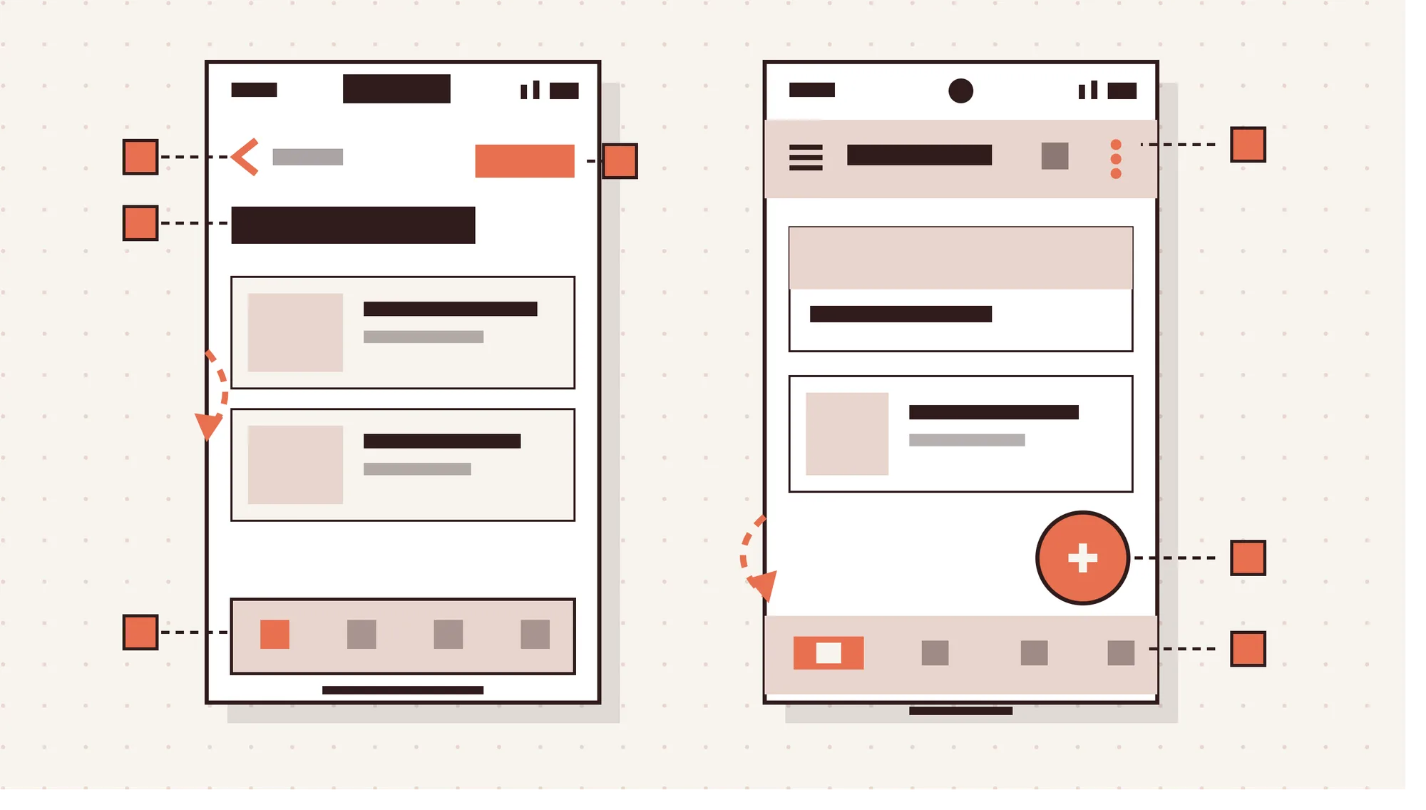
Navigation differs between iOS and Android in 5 places, from primary menus to back behavior. Each one changes how people move through your app and where they look for controls.
The 5 main navigation differences between iOS and Android apps are given below.
- Primary navigation: iOS uses a bottom tab bar with 2 to 5 tabs that can minimize on scroll. Android uses a navigation bar, a navigation rail on wider screens, or a navigation drawer.
- Back navigation: iOS shows a back button at the top left and supports a left-edge swipe. Android uses a system back gesture, and predictive back previews the destination first.
- Top bar titles: iOS screens often open with a large title that shrinks as people scroll. Android uses a top app bar, usually with a left-aligned title and action icons.
- Primary action placement: iOS puts the main action in a top-right bar button, such as Add. Android often uses a floating action button at the bottom right, near the thumb.
- Secondary destinations: iOS moves extra sections into a More tab or a toolbar menu. Android tucks them into an overflow menu or a navigation drawer, the modern hamburger menu.
What Are the Typography Differences Between iOS and Android?
iOS and Android use different system fonts, text units and scaling rules. iOS uses San Francisco, or SF Pro, with New York available as a serif option. The default text size is 17 pt, and Apple sets 11 pt as the minimum.
Dynamic Type lets iOS users choose their preferred text size across apps. Apple advises letting people enlarge text by at least 200 percent. So your layouts must reflow and wrap text instead of clipping it.
Android uses Roboto as the default Material typeface. Text is measured in sp, or scale-independent pixels. Unlike dp, sp also scales with the font size people pick in their device settings.
Both platforms share one contrast rule. Small text needs a contrast ratio of at least 4.5:1 against its background. Font weight helps hierarchy, but it never replaces enough contrast.
How Do Screen Sizes, Units and Touch Targets Differ on iOS and Android?
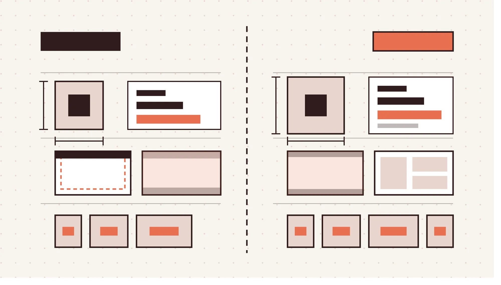
iOS measures layouts in points, or pt, and Android measures them in density-independent pixels, or dp. Both units ignore screen density, so elements keep a similar physical size across devices.
Touch targets differ slightly. iOS sets 44 x 44 pt as the default and 28 x 28 pt as the minimum. Android sets 48 x 48 dp as the minimum.
Adaptive layouts use different systems. iOS works with compact and regular size classes. Android window size classes run compact under 600 dp, medium at 600 to 839 dp, and expanded beyond.
Device range is the biggest practical gap. Apple controls a small set of devices with predictable viewports. Android designs must cover many manufacturers, screen sizes and densities.
The layout specifications for iOS and Android are shown in the table below.
| Specification | iOS | Android |
|---|---|---|
| Unit of measurement | Points, pt | Density-independent pixels, dp |
| Text unit | Points, scaled by Dynamic Type | Scale-independent pixels, sp |
| Default touch target | 44 x 44 pt | 48 x 48 dp |
| Minimum touch target | 28 x 28 pt | 48 x 48 dp |
| Adaptive layout | Compact and regular size classes | Compact, medium and expanded window size classes |
| Screen edges | Content respects the safe area around system UI | Apps draw edge-to-edge and handle system bar insets |
| Device range | Apple-controlled, predictable viewports | Many manufacturers and screen sizes, so more test devices |
How Do Foldable Phones Change iOS and Android Layouts?
Foldable phones force layouts to adapt to space that changes while the app is open. On Android, medium width covers most unfolded inner displays in portrait. So layouts should switch to two panes by window size class, like a list beside its details.
Apple unveiled iPhone Duo, its first foldable iPhone, in September 2026. "Designing for iPhone Duo" joined the HIG on September 9, 2026.
The guidance covers two displays and a center hinge. It also places toolbars and tab bars on the side of the outer display.
Both platforms now point to the same rule. Design by available space, not by device type.
How Do UI Components Differ Between iOS and Android?
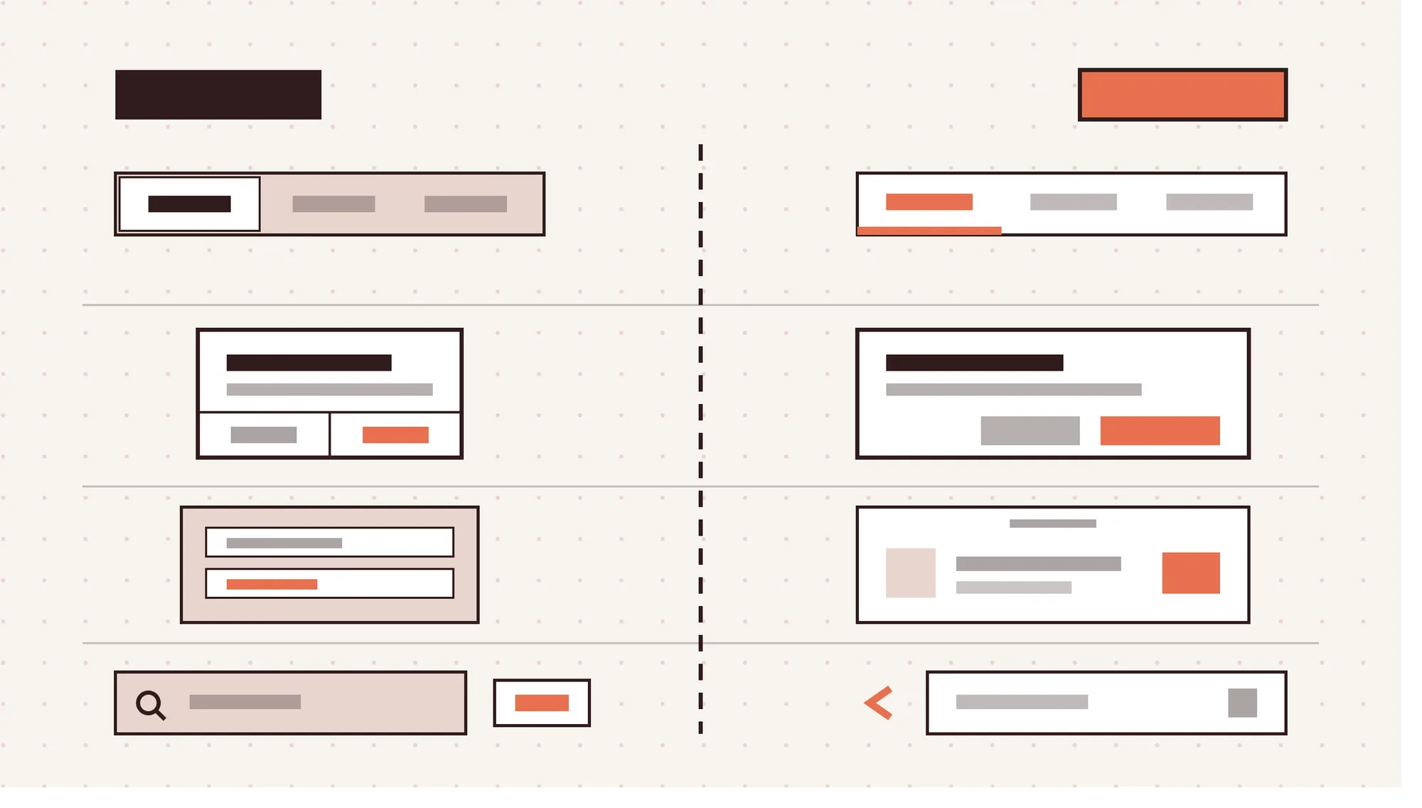
iOS and Android handle the same tasks with different native components, from primary actions to search. The names differ, and so do placement, shape and behavior. Getting these right is what makes each version feel at home.
The 7 UI component differences between iOS and Android are shown in the table below.
| Component | iOS | Android |
|---|---|---|
| Primary action | Button at the top right of the navigation bar | Floating action button at the bottom right |
| View switching | Segmented control | Tabs, or Material 3 segmented buttons for options |
| Alerts and dialogs | Alerts, centered on screen | Dialogs |
| Short feedback and undo | Centered alert or bottom action panel, with destructive actions in red | Snackbar with an optional Undo action |
| Date pickers | Scrolling wheels or an inline calendar | Calendar view |
| Action menus | Action sheet that slides up, and context menus that blur the background | Overflow menu, often called a kebab menu, and bottom sheets |
| Search cancel | Cancel text button | Back arrow |
Use native system components wherever you can. They pick up Liquid Glass and Material 3 Expressive styling automatically, along with future system updates.
How Do App Icons Differ Between iOS and Android?
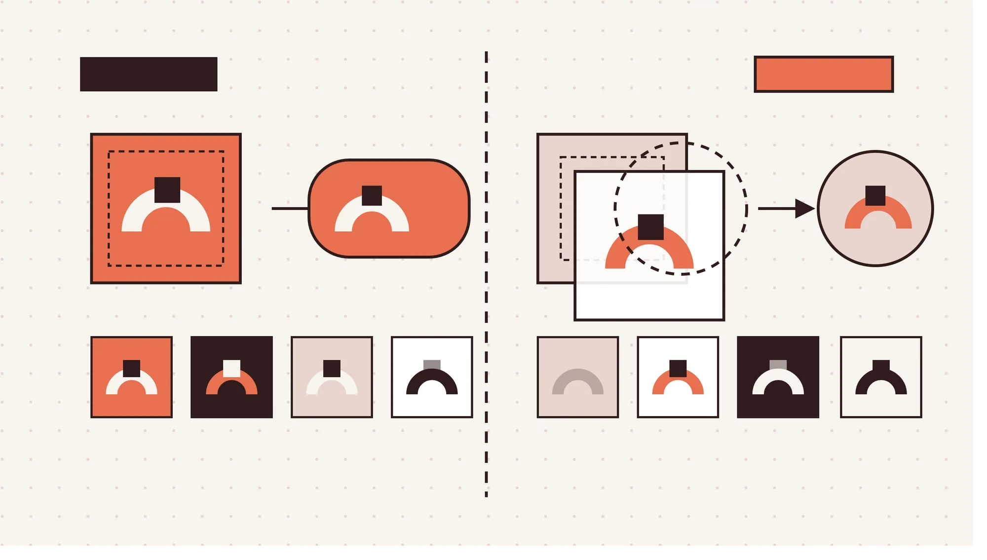
iOS and Android app icons differ in canvas size, masking, appearance variants and system effects. Both should come from the same brand mark, but each platform needs its own production files.
The 4 main app icon differences between iOS and Android are outlined below.
- Canvas and format: iOS starts from a 1024 x 1024 px square, often a layered Icon Composer file. Android adaptive icons use 108 x 108 dp layers with a 66 x 66 dp safe zone.
- Shape and masking: iOS applies its rounded rectangle mask automatically, so you supply a full square. On Android, the device maker's mask sets the shape, such as a circle.
- Appearance variants: iOS icons need default, dark, clear and tinted versions. Android has supported themed monochrome icons since Android 13, and auto-themes them from Android 16 QPR2.
- Visual effects: iOS applies Liquid Glass highlights and refraction at the system level. Android reserves the outer 18 dp of each layer for parallax and pulse effects.
How Is AI Changing iOS and Android App Design?
AI is changing iOS and Android app design by turning assistants into users of your interface. Siri and Gemini now read screen structure and take actions inside apps. So labeled, standard native components matter more than they did before.
The 5 biggest AI changes affecting iOS and Android app design are given below.
- Assistants that act inside apps: Siri uses App Intents to act in apps on iOS 27. Gemini uses AppFunctions and UI automation on Android.
- On-device generative features: Apple's Foundation Models framework and Google's Gemini Nano run models on the device. Features stay fast and private without a server.
- Official AI design guidance: Apple's HIG Generative AI page was updated on June 8, 2026. It covers refining results and feedback during generation.
- AI design and prototyping tools: Prompt-based tools now generate screens and clickable flows in minutes. Google Stitch with Gemini 3 is a leading example.
- AI-assisted design-to-code: Xcode 27 adds coding agents and a Figma integration. The gap between a design file and working code keeps shrinking.
How Do Siri and Gemini Interact With App Interfaces?
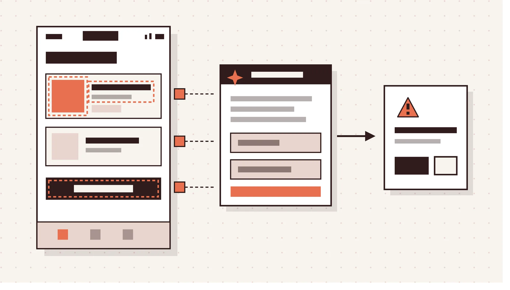
Siri and Gemini interact with app interfaces by reading what's on screen and triggering app actions. iOS 27, released September 14, 2026, brought a rebuilt Siri. It reads onscreen content and acts in apps through App Intents.
Google announced AppFunctions on February 25, 2026. AppFunctions let apps expose specific functions to AI agents. UI automation lets Gemini complete multi-step tasks while users watch, take over, or confirm before purchases.
Gemini Intelligence in Android 17 needs Gemini Nano v3 and at least 12 GB of RAM. At launch, that meant recent phones such as the Pixel 10 and Galaxy S26.
The design implications are clear. Core tasks must work without the full UI, through App Intents or AppFunctions. Every element needs a clear accessibility label, and sensitive actions need a confirmation step.
What Are the Design Guidelines for AI Features on iOS and Android?
The design guidelines for AI features focus on control, transparency and recovery. They come from Apple's HIG Generative AI page, but they work as a baseline for Android too.
The 6 design rules for AI features in mobile apps are given below.
- Keep people in control: Let people decide when AI acts, and make AI features easy to skip or turn off.
- Communicate where the app uses AI: Label AI-generated content and actions so people know what came from a model.
- Set clear expectations: Explain what the feature can and can't do, including the chance of wrong results.
- Make results easy to refine, retry or revert: Let people edit an output, generate again or restore the earlier version.
- Ask permission first: Confirm before irreversible actions like sending or buying, and before using personal data.
- Design for processing time: Show specific progress messages while the model works, not a generic spinner. Many of the same AI UX design patterns apply to SaaS dashboards and web apps.
How to Design an App for Both iOS and Android?
To design an app for both iOS and Android, share the product logic and adapt the platform layer. People get the same features and brand, but each version follows its own native conventions.
The 7 steps to design an app for both iOS and Android are given below.
- Define shared user flows and information architecture: Map screens, tasks and content hierarchy once. These flows stay the same on both platforms.
- Build one design system with platform-specific tokens: Create shared Figma components. Then add tokens for color, type and spacing per platform.
- Map each screen to native patterns: Pick the tab bar or navigation bar, back behavior and components for each screen. Document it for SwiftUI and Jetpack Compose developers.
- Apply each platform's fonts, units and touch targets: Use SF Pro and points on iOS, and Roboto and dp on Android. Check targets against 44 pt and 48 dp.
- Adapt layouts for screen sizes and foldables: Design for compact, medium and expanded widths. Plan two-pane layouts for tablets, Android foldables and iPhone Duo.
- Plan AI features and assistant entry points: Choose which actions Siri and Gemini reach through App Intents and AppFunctions. Label every key element.
- Prototype and test on real iOS and Android devices: Run usability testing on actual iPhones and several Android phones. Emulators miss gesture conflicts and font scaling issues. Clean developer handoff ties these steps together. Hiring outside mobile app design services? Ask for separate iOS and Android specs in every handoff file.
Should You Design for iOS or Android First?
Design for iOS or Android first based on your target users' location and your revenue model. Android holds 72.36% of the worldwide mobile market, against 27.61% for iOS. StatCounter's figures are for October 2026.
The US tells a different story. There, iOS leads with 53.59% as of September 2026. So a US-focused app with paid subscriptions often makes sense to launch on iOS first.
Global reach points the other way, toward Android. Also weigh your testing budget, because Android needs more test devices to cover its range of screens. That extra testing can stretch an MVP timeline.
Can You Use the Same Design for iOS and Android?
No, you shouldn't use an identical design for iOS and Android because each platform has different interaction conventions. You can share the brand identity, layout logic and user flows across both.
But navigation, back behavior, components, fonts and icons should adapt. Skip that step, and one version will feel foreign to its users, even with a cross-platform framework.
Is It More Expensive to Design for Android Than iOS?
Yes, designing for Android is usually more expensive than designing for iOS because there's more to cover. Android runs on devices from many manufacturers, with more screen sizes and layout states.
Each extra state adds design hours and testing time. The final number depends on project scope, so an app design cost breakdown helps you budget both versions.
Do iOS Apps Look Better Than Android Apps?
No, iOS apps don't look better than Android apps because polish comes from consistency, not the platform itself. Apple controls its hardware and guidelines tightly, so iOS apps tend to look more uniform.
Android's device range makes polish harder, not impossible. In Google's Material 3 Expressive research, 87% of 18 to 24-year-olds preferred expressive designs.
What Are the Pros and Cons of Platform-Specific App Design?
Platform-specific app design, also called native design, builds each version to follow its own platform's guidelines. The pros and cons of platform-specific app design are given in the table below.
| Pros | Cons |
|---|---|
| Feels familiar because it matches each platform's patterns | Two sets of screens and components to design and maintain |
| Standard components pick up system styles like Liquid Glass automatically | Android fragmentation adds design and testing time |
| Built-in accessibility, such as Dynamic Type and 48 dp targets in Compose components | Harder to keep brand identity identical across platforms |
| Following guidelines speeds up design and lowers development cost | Guidelines change every year and need tracking |
| Native, labeled UI is easier for Siri's onscreen awareness to read | Custom brand effects can clash with system materials, so Apple advises using Liquid Glass sparingly in custom controls |
Which AI Tools Help Design iOS and Android Apps?
The main AI tools for iOS and Android app design cover every stage, from first screens to code. Each one fits a different part of the workflow.
The top AI tools for designing iOS and Android apps are given below.
- Google Stitch: A Google Labs tool that uses Gemini 3 to generate UI from prompts. Prototypes link screens into clickable flows.
- Figma Make: Figma's prompt-to-prototype tool turns a description or existing design into a working prototype.
- Xcode 27 coding agents: Apple's IDE supports agents from Anthropic, Google and OpenAI, plus a Figma integration.
- Gemini in Android Studio: Google's built-in assistant helps developers write Jetpack Compose code and fix errors.
Will AI Replace Mobile App Designers?
No, AI will not replace mobile app designers because speed isn't the same as judgment. AI tools can generate a set of screens in minutes.
But someone still has to apply platform guidelines and check accessibility. Designers also run user research and review AI output. Teams that pair AI-assisted design and development with senior review get both speed and quality.
What Are the Differences Between Related App Design Approaches?
Related app design approaches differ in how much they share between platforms and how they handle personalization. The two comparisons below cover the terms people mix up most often.
What Is the Difference Between Native and Cross-Platform App Design?
Native app design creates a separate experience for each platform, while cross-platform design starts from one shared codebase. Frameworks like Flutter and React Native let teams share most UI code across iOS and Android.
Shared code saves time, but it doesn't remove platform differences. The design should still adapt navigation, back behavior and components for each platform. Teams planning mobile app development on a shared codebase should budget for that adaptation early.
What Is the Difference Between Material Design and Material You?
Material Design is Google's full design system, while Material You is its personalization layer. Material You arrived with Android 12 in 2021 as part of Material 3. It generates dynamic color from the user's wallpaper and applies it across the interface.
Material 3 Expressive is the 2025 expansion of Material 3. It adds bolder shapes, motion and color on top of that wallpaper-based theming.
Final Thoughts
iOS vs Android app design differs across design systems, navigation, typography, layout units, components and icons. The strongest apps share one product structure and brand, then adapt each layer to its platform.
AI assistants and foldable screens raise the stakes. Siri and Gemini read native, well-labeled interfaces best, and new form factors reward layouts built on available space.
If your agency needs senior designers for both platforms, Panze can work as your white label design agency. We design iOS and Android apps under your brand. You take on more mobile projects without growing your team.
Frequently Asked Questions
Does Android 17 Use Liquid Glass?
No, Android 17 does not use Liquid Glass because its blur effect is built on Material 3 Expressive. The frosted blur appears in the volume slider, power menu, Quick Settings and notification shade. Its tint comes from Dynamic Color, not from refracted content. On May 5, 2026, Google's Sameer Samat answered the comparison on X with a blunt "not happening."
How Do Accessibility Guidelines Differ Between iOS and Android?
Accessibility guidelines on iOS and Android share core principles but differ in tools and target sizes. iOS asks for 44 x 44 pt touch targets, and Android asks for 48 x 48 dp. Both set 4.5:1 as the contrast ratio for small text.
On iOS, designers test with VoiceOver, the built-in screen reader, and with Dynamic Type for text scaling. On Android, TalkBack reads the screen aloud, and the Accessibility Scanner app flags small targets and low contrast.
Apple also added Accessibility Nutrition Labels to the App Store. These labels show which accessibility features an app supports before people download it.
Can You Use a Floating Action Button on iOS?
Yes, you can use a floating action button on iOS, but it isn't a native iOS pattern. The HIG has no floating action button component. iOS users expect the main action in the navigation bar or a bottom toolbar.
A floating button can work for a strong brand pattern, like a compose button. Keep it clear of the tab bar and test it against Liquid Glass controls.
Should You Use SF Pro on Android or Roboto on iOS?
No, you shouldn't swap system fonts between platforms because each font is tuned for its own system. Apple licenses SF Pro for designing apps on Apple platforms only. Roboto on iOS also looks out of place next to system alerts and controls.
For one look on both platforms, use a custom brand typeface instead. Then map it to each platform's text styles and scaling rules.
Do Android Apps Need an On-Screen Back Button?
No, Android apps don't need an on-screen back button because the system back gesture handles back navigation. People swipe from either screen edge to go back, and predictive back previews where they'll land.
The up arrow in the top app bar is a different control. It moves people up the app's hierarchy, so use it on detail screens, not on top-level screens.
Do iOS and Android Handle Dark Mode Differently?
Yes, iOS and Android handle dark mode differently, though both let people switch the whole system at once. iOS has offered Dark Mode since iOS 13, and Android added a system dark theme in Android 10.
On iOS, semantic system colors adapt automatically, and app icons can include a dark variant. On Android, Material 3 color roles generate the dark scheme, with Dynamic Color tinting surfaces from the wallpaper.