Something shifted in 2025. Users started noticing when a product felt soulless.
AI-generated everything flooded the web. Layouts looked the same. Copy felt robotic. And users, consciously or not, started disengaging. Bounce rates crept up. Onboarding completions dropped.
The response? A full-swing back to human-centered design. Warm, expressive, fast, and intentional.
But here's what most trends articles miss. A beautiful homepage doesn't move your SaaS metrics. What moves them is a product that feels right at every touchpoint: onboarding, dashboards, upgrade prompts, empty states, and error screens.
At Panze, we work with agencies and SaaS teams to build exactly that. So this isn't a list of pretty visuals. It's a practical guide to what's working in 2026 and how to apply it to real products.
The thesis: winning designs in 2026 feel deeply human and deliver measurable results.
TL;DR
Here's a quick breakdown of the biggest web design trends in 2026, where they work best, and the business impact they deliver.
| Trend | Best For | Business Impact |
|---|---|---|
| Organic & Anti-Grid Layouts | SaaS dashboards, landing pages | Higher engagement, lower bounce |
| AI Personalization | Onboarding flows, feature discovery | Better adoption, reduced churn |
| 3D & Immersive Elements | Product showcases, e-commerce | Increased conversions |
| Kinetic & Expressive Typography | Hero sections, brand moments | Stronger brand recall |
| Glassmorphism 2.0 & Depth | Dashboards, modals, cards | Cleaner information hierarchy |
| Purposeful Motion & Micro-interactions | Onboarding, workflows | Reduced cognitive load |
| Dopamine Colors vs. Dark Mode | CTAs, pricing pages, enterprise tools | Higher click-through rates |
| Retro & Nostalgic Revival | Consumer apps, B2B with personality | Emotional connection, differentiation |
| Performance-First Design | All products | Better rankings, lower drop-off |
Top Web Design Trends Shaping 2026
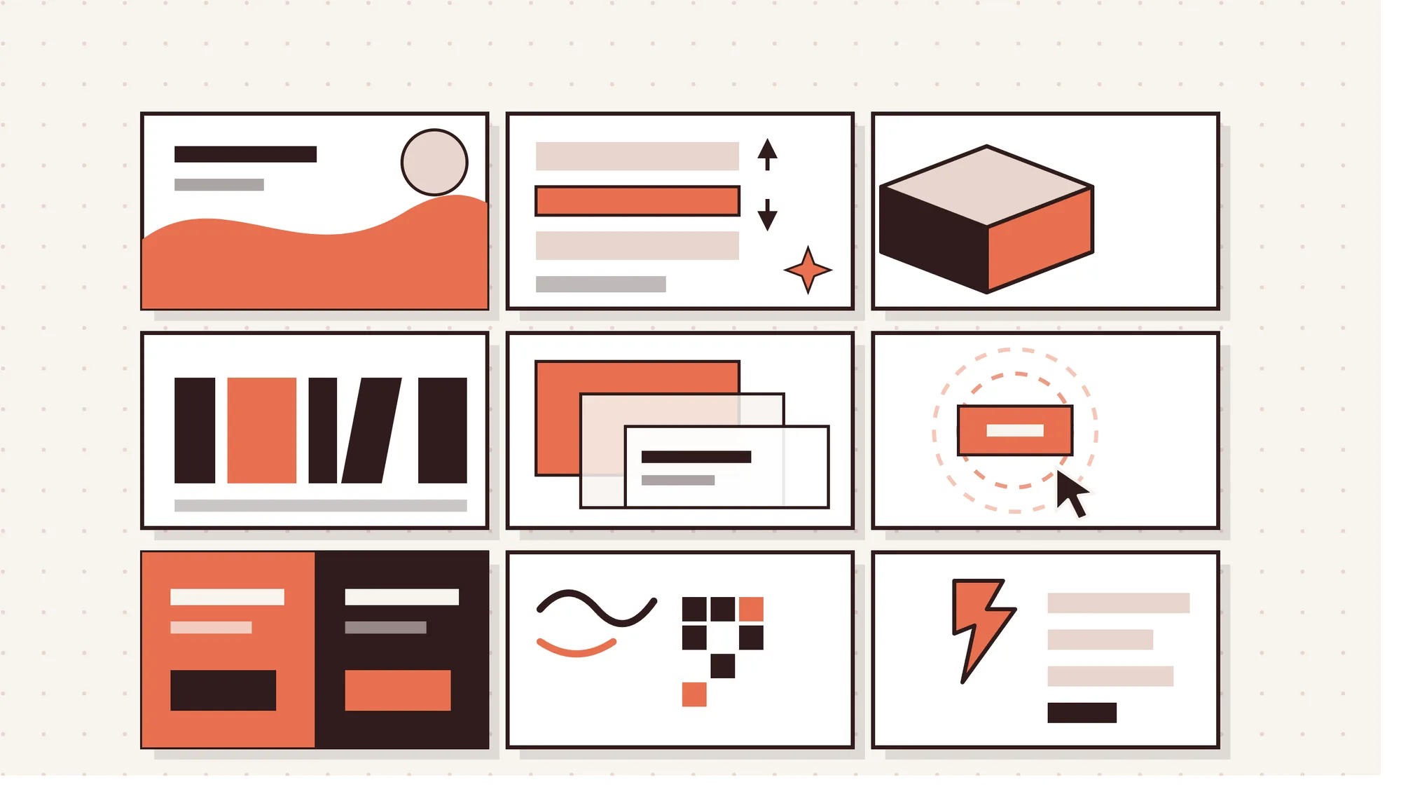
Web design in 2026 is focused on creating faster, more human, and experience-driven digital products. Brands are moving beyond generic layouts and adopting designs that improve engagement, usability, and conversions.
From AI-powered personalization to immersive visuals and minimalist interfaces, these trends are shaping the future of modern web experiences.
1. Organic Shapes, Fluid Layouts, and Human-Centered Design
Rigid grid layouts are losing. Organic, anti-grid design is winning.
After years of boxy, symmetrical interfaces, users respond better to layouts that breathe. Think curved sections, asymmetric content blocks, biomorphic shapes, and intentional whitespace. It's design that feels considered rather than templated.
Why it matters for SaaS: Dashboards have always been grid-heavy by necessity. But your landing pages, onboarding screens, and marketing pages don't need to be. Organic layouts reduce cognitive friction. They guide the eye more naturally. And in a market where most SaaS tools look identical, they make your brand memorable.
How to implement it without breaking things:
- Use fluid shapes as background layers, not as structural containers
- Keep data-heavy views (tables, charts) on a clean grid. Apply organic design to the surrounding UI
- Stick to CSS clip-path and SVG shapes for performance. Avoid heavy image masks
Pitfall to avoid: Organic doesn't mean chaotic. Every curve needs a reason. Randomness reads as unprofessional.
Business impact: Higher time-on-page, stronger brand differentiation, better first impressions on landing pages.
2. AI-Powered Personalization and Adaptive Interfaces
The best AI in product design is the kind users don't notice.
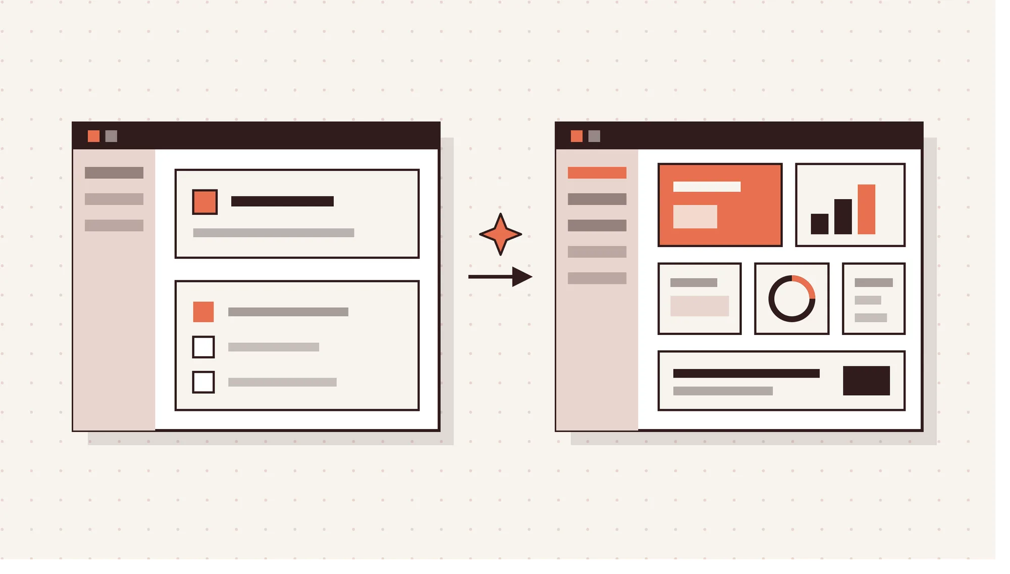
2026 is the year AI moves from flashy chatbot to silent assistant. Adaptive interfaces that change based on user behavior, role, or context. Onboarding flows that shorten when a user clearly knows what they're doing. Dashboards that surface the right widget at the right time.
This is agentic AI done right: AI that acts on behalf of the user without requiring them to ask.
SaaS implementation tips:
- Start with progressive onboarding. Show less to new users. Reveal complexity as they demonstrate readiness.
- Use behavioral data to reorder navigation items for power users
- Personalize empty states. "No tasks yet" is useless. "Here's what teams like yours do first" converts.
Pitfall to avoid: Personalization that feels like surveillance. Always make it clear why a user is seeing something different. Control and transparency build trust.
Business impact: Onboarding completion rates improve significantly when flows adapt to user behavior. Lower churn in the first 30 days, where most SaaS products lose users.
3. 3D Elements and Immersive Experiences (Without the Performance Hit)
3D works in SaaS. But only when it's lightweight and purposeful.
In 2026, 3D isn't reserved for gaming sites and Apple product pages. WebGL, Three.js, and optimized glTF models have made it practical for web apps. Interactive product previews, subtle 3D hero illustrations, and parallax depth effects are showing up across SaaS landing pages.
Where it earns its place:
- Product showcases where a 3D model helps users understand spatial features
- Hero sections where a floating UI element communicates "modern product" instantly
- Feature cards with subtle depth and layering
How to keep it fast:
- Use glTF/GLB format. It's compressed and web-optimized.
- Lazy-load 3D scenes. They shouldn't block your above-the-fold render.
- Set a performance budget. If a 3D element adds more than 300ms to your load time, it's not worth it.
- Always provide a static fallback for low-end devices.
Pitfall to avoid: 3D for the sake of it. A spinning logo is not a strategy.
Business impact: Immersive product demos reduce support questions. Users who understand your product before signing up convert at higher rates and churn less.
4. Kinetic and Expressive Typography
Typography is doing more work in 2026. A lot more.
Bold, oversized headlines are no longer just a style choice. They're a strategic tool. Text that moves, shifts weight on scroll, or reacts to cursor position creates emotional impact that static design simply can't match. And with variable fonts, you can do all of this without loading multiple font files.
For SaaS products, typography earns its place in:
- Hero headlines that establish product positioning instantly
- Feature section headers that animate in on scroll to pace the story
- Empty states and error messages with personality baked in
Variable fonts: the practical win. One file. Infinite weight and width variations. Fluid responsiveness across screen sizes. Faster load times than traditional multi-weight setups.
Pitfall to avoid: Animated text in dense data views. Kinetic typography belongs in storytelling moments, not inside your analytics dashboard.
Business impact: Expressive typography improves brand recall and sets the tone before a user reads a single word. For agencies building white-label products, strong type hierarchies signal quality immediately.
5. Glassmorphism 2.0, Tactile Depth, and Subtle Textures
Glassmorphism grew up. And it's better for it.
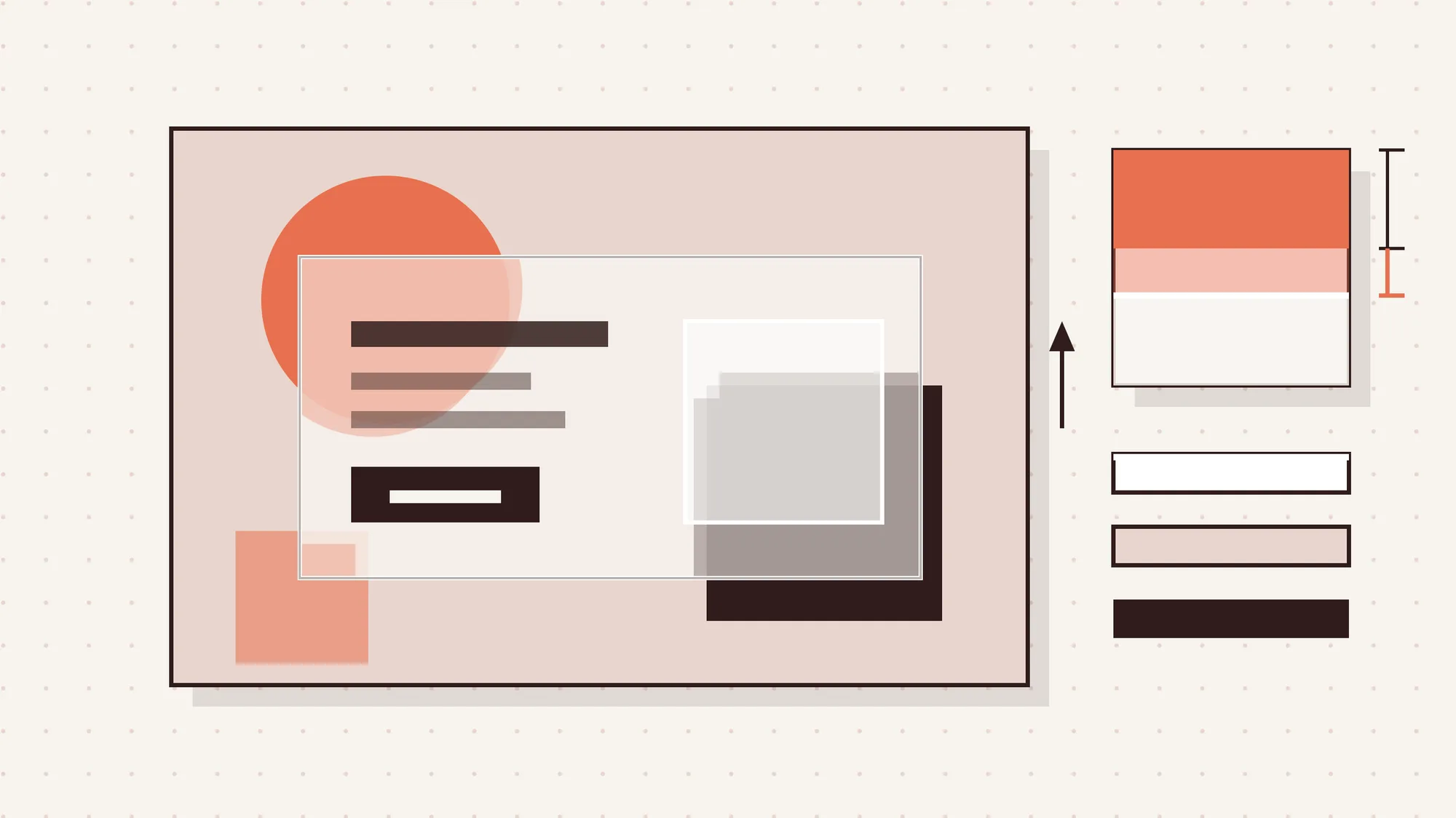
The frosted-glass effect from 2021 was everywhere. Then overused. Now it's back, more restrained and more purposeful. In 2026, glassmorphism 2.0 means layered transparency, soft blur, subtle grain textures, and refined shadows that create genuine depth without visual noise.
Where it works best in SaaS:
- Modal dialogs and drawer panels that need to feel distinct from the base UI
- Card components in dashboards where information hierarchy matters
- Notification overlays and tooltips that float naturally above content
The updated rules:
- Pair it with a strong background. The blur effect needs contrast to read well.
- Keep blur radius modest (8-16px). Heavy blur kills legibility.
- Add 1px borders with 10-15% opacity white. It completes the glass edge.
- Use RGBA backgrounds, not hex. Transparency is the whole point.
Pitfall to avoid: Glassmorphism on glassmorphism. Layering transparent cards on transparent backgrounds creates a muddy, unreadable mess.
Business impact: Clean depth cues reduce cognitive load. Users navigate faster when visual layers are clear. That translates to faster task completion inside your product.
6. Purposeful Motion, Micro-Interactions, and Scroll Storytelling
Motion isn't decoration. Every animation should earn its place.
The best SaaS products in 2026 use motion to communicate state, guide attention, and reduce confusion. A button that pulses when it's the next logical step. A form field that gently shakes when there's a validation error. A dashboard widget that slides in after data loads rather than popping abruptly into view.
Scroll storytelling takes this further on marketing pages. Content that reveals itself as the user moves down creates narrative pacing. Instead of dumping your feature list on the page, you walk users through a sequence. Each section earns the next.
Micro-interaction principles for SaaS:
- Transition durations between 150-300ms feel natural. Slower feels sluggish. Faster feels glitchy.
- Use easing curves: ease-out for entrances, ease-in for exits.
- Every interactive element should have a hover, active, and focus state.
Pitfall to avoid: Motion that triggers on every scroll tick is exhausting. Respect the prefers-reduced-motion media query. Always.
Business impact: Micro-interactions measurably reduce user errors. They make products feel polished and trustworthy. That trust directly affects conversion on upgrade prompts.
7. Dopamine Colors, Vibrant Gradients, and Refined Dark Mode
Color is doing two very different things in 2026, and both are right.
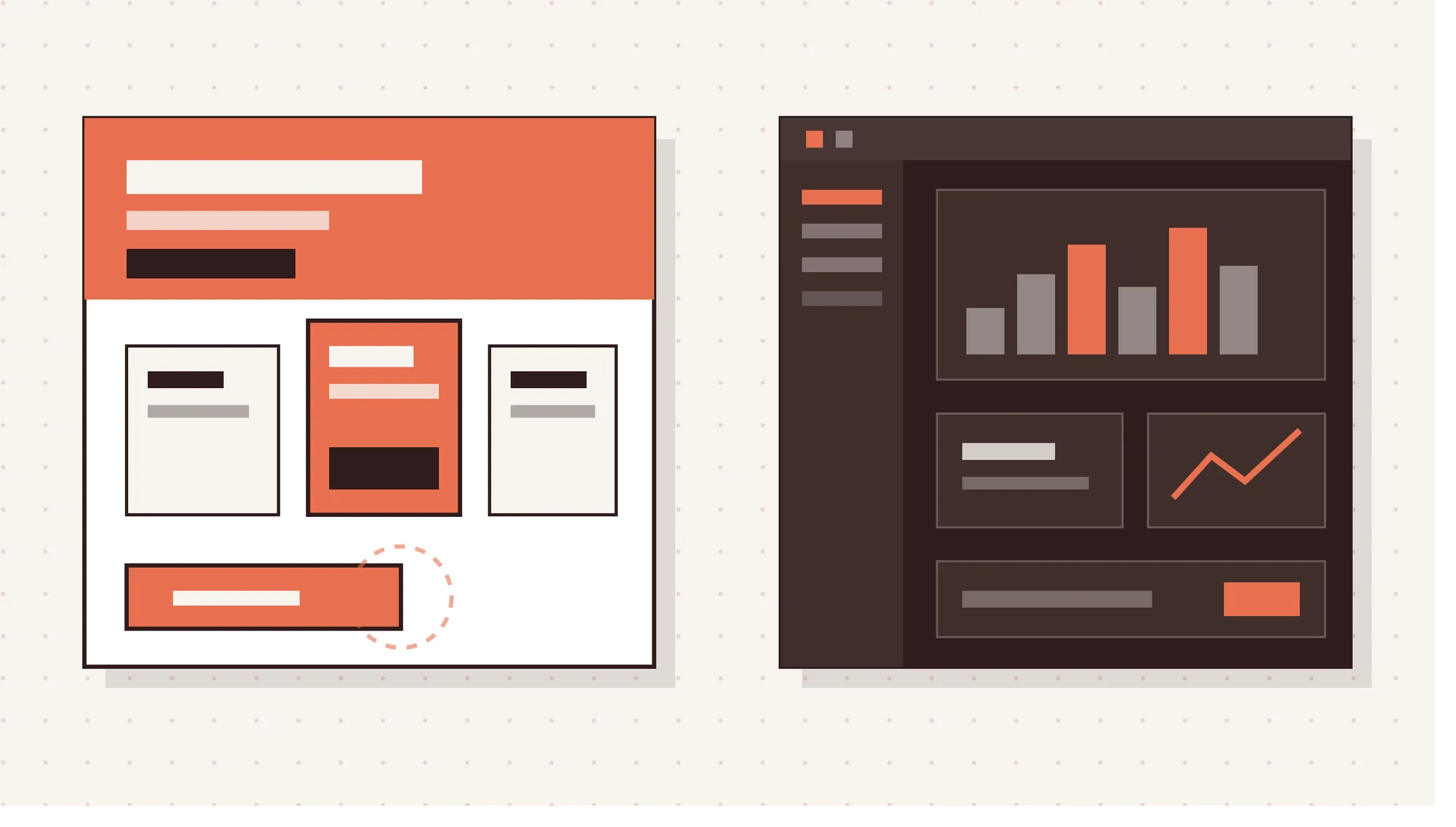
Bright, saturated palettes are back. Y2K nostalgia, dopamine design, and bold gradient combinations are showing up across consumer apps and SaaS marketing pages. At the same time, refined dark mode has matured into an expected standard for enterprise tools and developer-focused products.
The smart move is knowing which lane your product belongs in.
Vibrant palettes work for:
- Consumer-facing SaaS with broad audiences
- Onboarding screens where energy and optimism help users push through friction
- CTA buttons and pricing page highlights
Dark mode works for:
- Developer tools, analytics platforms, and data-heavy dashboards
- Any product where users spend 4+ hours per day
- Enterprise buyers who associate dark interfaces with seriousness and focus
Gradient tips for 2026: Move beyond two-color blends. Mesh gradients with 3-4 color stops feel organic and modern. Keep them as backgrounds, not on text.
Pitfall to avoid: Launching dark mode as an afterthought. A real dark mode isn't just filter: invert(). It needs a separate design token system with tested contrast ratios.
Business impact: Color directly influences perceived speed, trust, and emotion. The right palette increases CTA click-through rates and reduces drop-off on long onboarding flows.
8. Retro and Nostalgic Revival with a Modern Twist
Nostalgia converts. But only when it's intentional.
Hand-drawn elements, scribble accents, dial-up era textures, 80s-inspired color blocks, and neo-brutalist layouts are rising as a direct counter to AI's polished aesthetic. Users are drawn to things that feel made by people. Imperfect, warm, and specific.
For SaaS and app products, this shows up as:
- Hand-drawn illustration styles in onboarding screens
- Serif or slab-serif type pairings that feel editorial rather than corporate
- Brutalist UI elements for products targeting creative or developer audiences
- Retro-inspired color palettes for B2B tools that want to feel approachable
The key distinction: Retro as a brand decision, not a decoration decision. It has to connect to who your users are. A fintech platform adding scribble fonts just because they're trendy will confuse users. A project management tool for creative agencies doing it? That's brand alignment.
Pitfall to avoid: Nostalgia that hurts usability. Pixelated fonts are fun until someone can't read their invoice. Visual style has to work alongside clarity.
Business impact: Emotional differentiation. In a crowded SaaS market, feeling like a distinct product is a retention driver. Users stick with tools they have a relationship with.
9. Performance-First Design and Sustainable Web Practices
Fast is a design decision. And in 2026, slow is expensive.
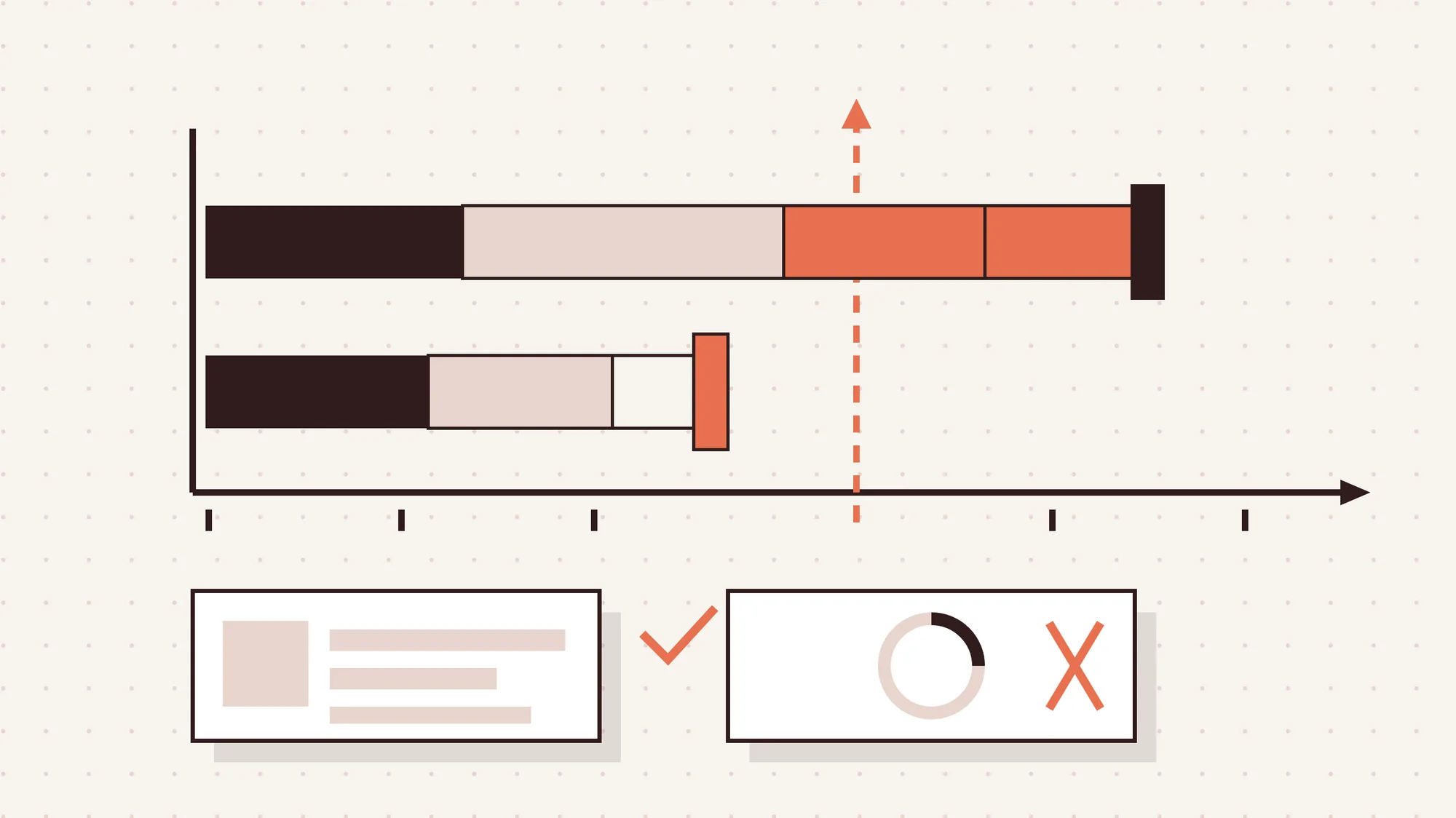
Core Web Vitals now directly influence search rankings. But beyond SEO, performance is a retention issue. Every 100ms added to your load time reduces conversion rates. Every unnecessary animation burns CPU on a user's aging laptop.
Design-side performance checklist:
- Choose system fonts or variable fonts over decorative font stacks
- Use SVG for icons and illustrations, not PNG or JPG
- Design with lazy-loading in mind. Above-the-fold content gets priority. Everything else can wait.
- Avoid layout shifts. Define explicit dimensions for images and media from the start.
- Design skeleton loaders instead of spinner animations. They feel faster even when they aren't.
Sustainable design practices:
- Dark backgrounds consume less power on OLED screens
- Fewer HTTP requests mean less energy per page load
- Simplified layouts with fewer assets are faster and greener
Pitfall to avoid: Handing off a gorgeous Figma file with no performance conversation. Performance needs to be part of the design system, not a developer afterthought.
Business impact: A 1-second improvement in load time can improve conversions by 2-5%. For SaaS trial sign-up pages, that's significant. For mobile users in emerging markets, it's the difference between a session and a bounce.
How These Trends Directly Impact SaaS Metrics
Design trends aren't vanity. They connect to real numbers.
| Trend | SaaS Metric It Moves |
|---|---|
| Adaptive AI interfaces | Onboarding completion, 30-day retention |
| Micro-interactions | Task completion rate, error rate |
| Organic layouts | Time-on-page, bounce rate |
| Performance-first design | Trial conversion, mobile retention |
| Expressive typography | Brand recall, perceived quality |
| Dopamine color on CTAs | Click-through rate, upgrade conversions |
The pattern: every design decision either adds or removes friction. The trends that win in 2026 all reduce friction in some way while increasing emotional connection.
Choosing the Right Trends for Your Product Stage
Not every trend belongs in every product. Here's how to think about it.
Early-stage SaaS (MVP): Focus on performance, clear typography hierarchy, and one strong brand color. Organic layouts and micro-interactions can come later. Right now, clarity beats creativity.
Growth-stage SaaS: This is where you invest in expressive typography, scroll storytelling on your marketing site, and adaptive onboarding. You have users. You have data. Use it.
Mature SaaS: Dark mode as standard, glassmorphism in your UI system, AI personalization layered into the experience. You're competing on feel now, not just features.
The rule of thumb: complexity in design should match the complexity your users are ready for.
White-Label Implementation: From Figma to Production
Translating trends into production-ready code is where most agencies hit a wall.
Design system first: Every trend needs to live in a system before it lives in a screen. Variable fonts become a typography scale. Glassmorphism becomes a card component. Dopamine colors become a semantic token set. If it's not in the system, it won't scale.
Component-level annotations: Developers shouldn't have to guess what happens on hover, on mobile, or on error. Motion specs, state variations, and breakpoints belong in the handoff, not in Slack.
Performance specs alongside design specs: Target load times, animation durations, and image compression requirements should be documented in the same Figma file as the visual design.
At Panze, we build design systems that agencies can hand to any development team and get consistent results. No translation layer. No "it looked different in Figma."
Common Mistakes Agencies Make Applying 2026 Trends
Knowing what's trending isn't enough. Knowing what goes wrong matters more.
Mistake 1: Applying trends without a brand rationale- Glassmorphism for a legal tech platform. Brutalism for a healthcare app. If the trend doesn't connect to the product's audience and personality, it reads as random.
Mistake 2: Designing trends in isolation- A great hero with kinetic typography and a generic dashboard below it creates whiplash. Trends need to thread through the whole experience.
Mistake 3: Ignoring mobile from the start- Over 60% of SaaS trial signups happen on mobile. Organic layouts that look fluid on desktop can collapse on smaller screens if not designed mobile-first.
Mistake 4: Skipping the performance conversation- A 3D hero element that drops a page's LCP score from 1.8s to 4.2s will hurt more than it helps.
Mistake 5: Handing off without a design system- One-off screens don't scale. If a client comes back in 6 months to add a new feature, the whole thing needs to be reconstructed from scratch.
Conclusion
The best web design in 2026 doesn't announce itself. It just works.
Users feel it in the load time, in the micro-interaction that confirms their click, in the onboarding screen that doesn't overwhelm them, in the dashboard that shows them exactly what they need. The trends in this article aren't about aesthetics. They're about reducing friction, building trust, and keeping users engaged long enough to see your product's value.
That's what converts. That's what retains. That's what scales.
Need a reliable white-label partner to turn these trends into pixel-perfect, conversion-focused SaaS and app interfaces? Panze acts as a seamless extension of your team. We handle the design system, the handoff, and the iteration so your agency can focus on the client relationship.
Let's talk about what your product needs in 2026.
FAQ
What is the biggest web design trend in 2026?
The core movement is toward organic, human-centered design. Users now favor intentional, warm products over generic templates. Success is defined by combining expressive typography, organic layouts, and high-performance architecture.
How can AI personalization improve SaaS user retention?
Adaptive interfaces that adjust to user behavior reduce the learning curve and surface the right features at the right time. The biggest win is in the first 30 days, where most SaaS products lose users. Personalized onboarding, contextual empty states, and role-based navigation all help users reach the "aha moment" faster, which drives retention.
Will heavy 3D elements hurt my site's performance?
Yes, if implemented carelessly. The safe approach is to use glTF/GLB models, lazy-load 3D scenes, and set a performance budget before any 3D asset goes into production. A 3D element that adds more than 300ms to your load time should be redesigned or removed.
How do I implement these trends without an in-house design team?
White-label design partnerships offer a solution for agencies and SaaS firms. Instead of hiring in-house, they collaborate with experts who provide design systems and production-ready handoffs. Panze functions as an embedded extension of your team, ensuring consistency without the overhead.
What web design trends improve SaaS conversions the most?
Micro-interactions on CTAs, adaptive onboarding flows, and performance improvements are the highest-ROI design investments. They reduce friction at the moments that matter most: sign-up, activation, and upgrade.
How do I choose the right trends for my product's current stage?
Match design complexity to your product maturity. Early-stage SaaS needs clarity above all else. Growth-stage products should invest in expressive marketing design and adaptive onboarding. Mature products can layer in AI personalization, dark mode systems, and premium UI depth.